This logo concept is a new design that does not use braille. It has been designed to enhance the accessibility, readability and recognisability of the current logo
It is modern and inclusive positioning Deafblind Australia as a national body for deafblindness
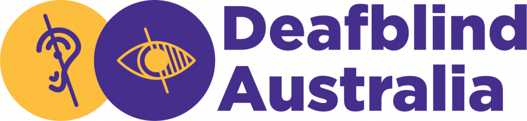
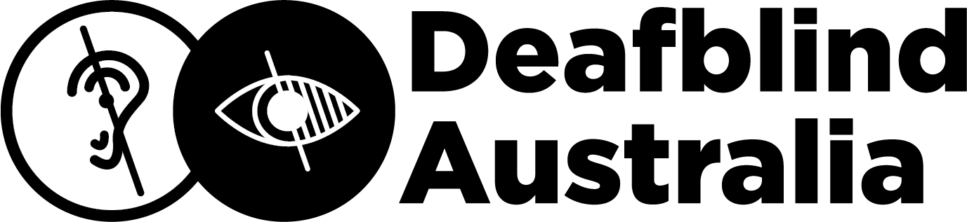
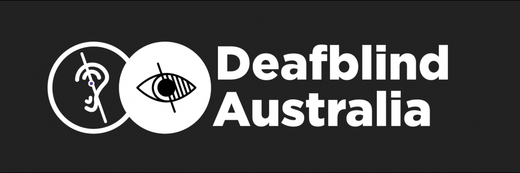
The icon to the left of the text ‘Deafblind Australia’ is two circles slightly overlapping in the middle. The first circle has a deaf symbol and the second circle has a blind symbol
The deaf symbol in the first circle is a simple illustration of an ear with a vertical line leaning to the left through it, the blind symbol in the second circle is a simple illustration of an eye, half of the eye is shaded with smaller lines it has a vertical line leaning to the left through it.
The overlap between the circles represents the deafblind community and its diversity
The first circle is yellow and the second circle and text are violet – introducing the brands main colours
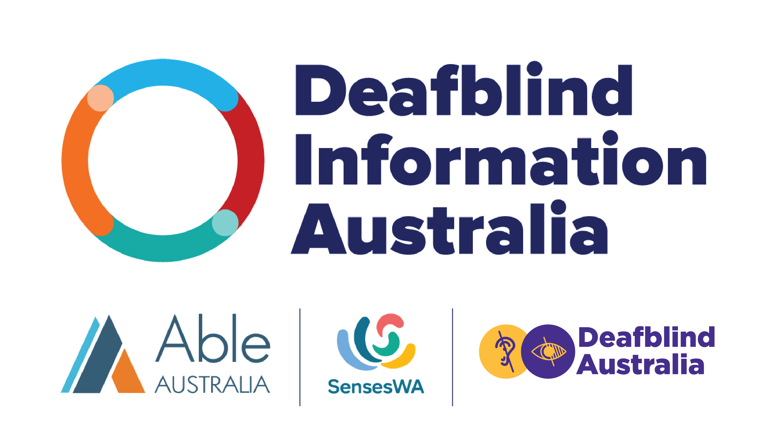
Logo stack
New logo positioned with other logos in the deafblind community including Deafblind Information Australia, Able Australia and Senses W.A..
Colours
Primary colours: Violet (main) and Yellow (highlight)
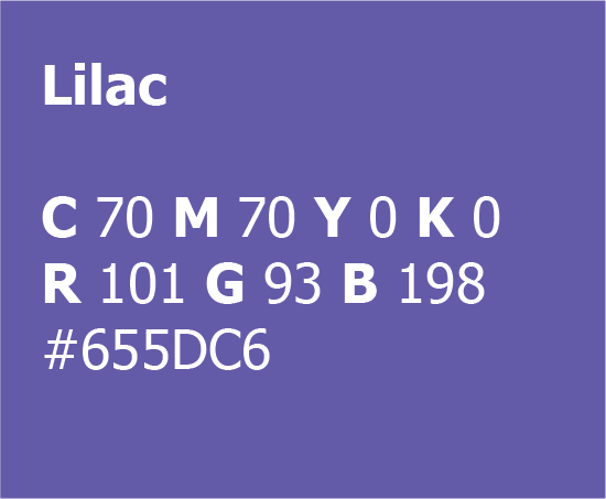
Secondary colour: Lilac
I have chosen these colours because of their accessibility, meaning, positivity and trustworthiness.
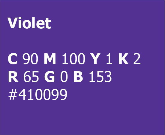
Violet:
Purple combines the calm stability of blue and the fierce energy of red. The color purple is often associated with royalty, nobility, luxury, power, and ambition.
Violet is one end of the visual light spectrum.
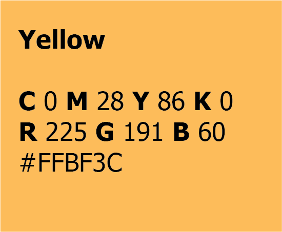
Yellow:
Yellow is associated with warmth, sunshine, and positivity.
It’s a colour that promotes activity and interaction.
Accessibility:
Violet may be used for text of any size on a white background
Violet may be used for large text on a yellow background.
Black may be used for text of any size on a white or yellow background.
Yellow may be used for large text reversed out of a violet or black background.
Lilac may be used for large text on a white or yellow background
Colour codes:
Violet Pantone Violet C
Yellow Pantone 136 C
Lilac Pantone 2725 C
Black Pantone Black C
Typography
The typeface used is called Tahoma. Tahoma is widely recognised as one of the most accessible fonts.
Sans serif font
Comes in Bold and Regular
Developed to be accessible
Headings and subheadings use bold
Paragraphs use regular
Headings – Tahoma bold
Sub headings – Tahoma bold
Sub headings – Tahoma regular
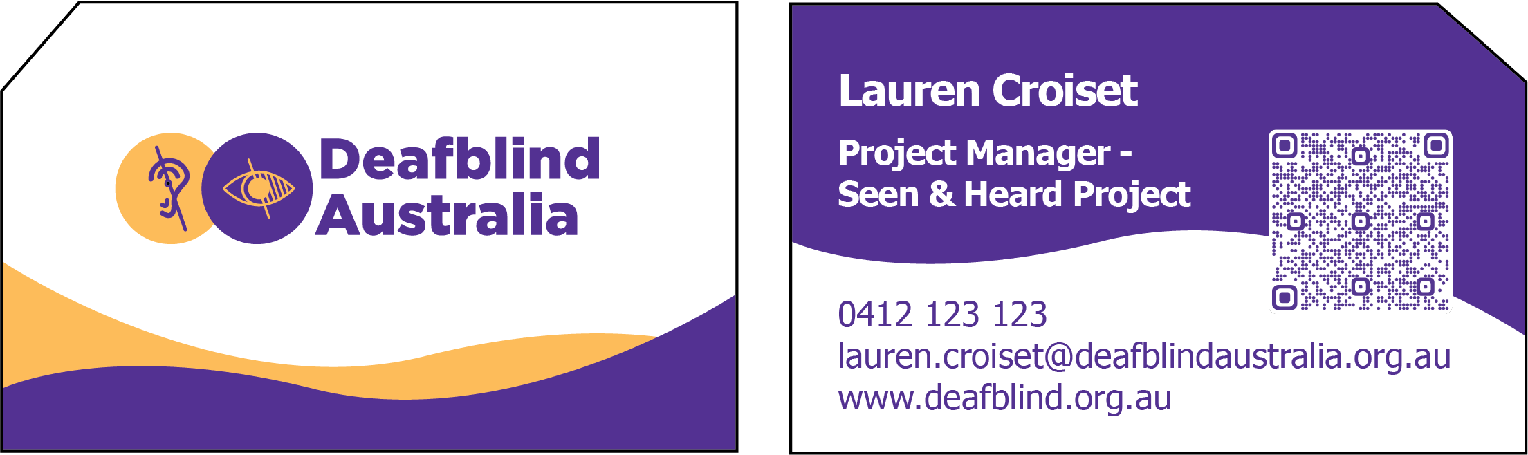
Business card
For all print materials, there will be a diagonal cut from the document to provide a tactile way for vision impaired people to know that there is a QR code within 3.5 inches of the corner. This is known as Berman Corner.
Front of the card has the Deafblind Australia logo. The front also has a decorative curved yellow shape overlapped by a violet curved shape at the bottom of the card.
These curved shapes are graphic elements of the brand.
The back of the card has the name, position, phone number, email address and DBA web address. These details appear in the described order and are left aligned.
There is a QR code on the right side of the back of the card.
The QR code creates a new contact entry on your phone when scanned and includes all the same information that is printed on the card.
Uses Berman corner on the top right for QR code .
Top half of the back of the card has a violet curved shape.
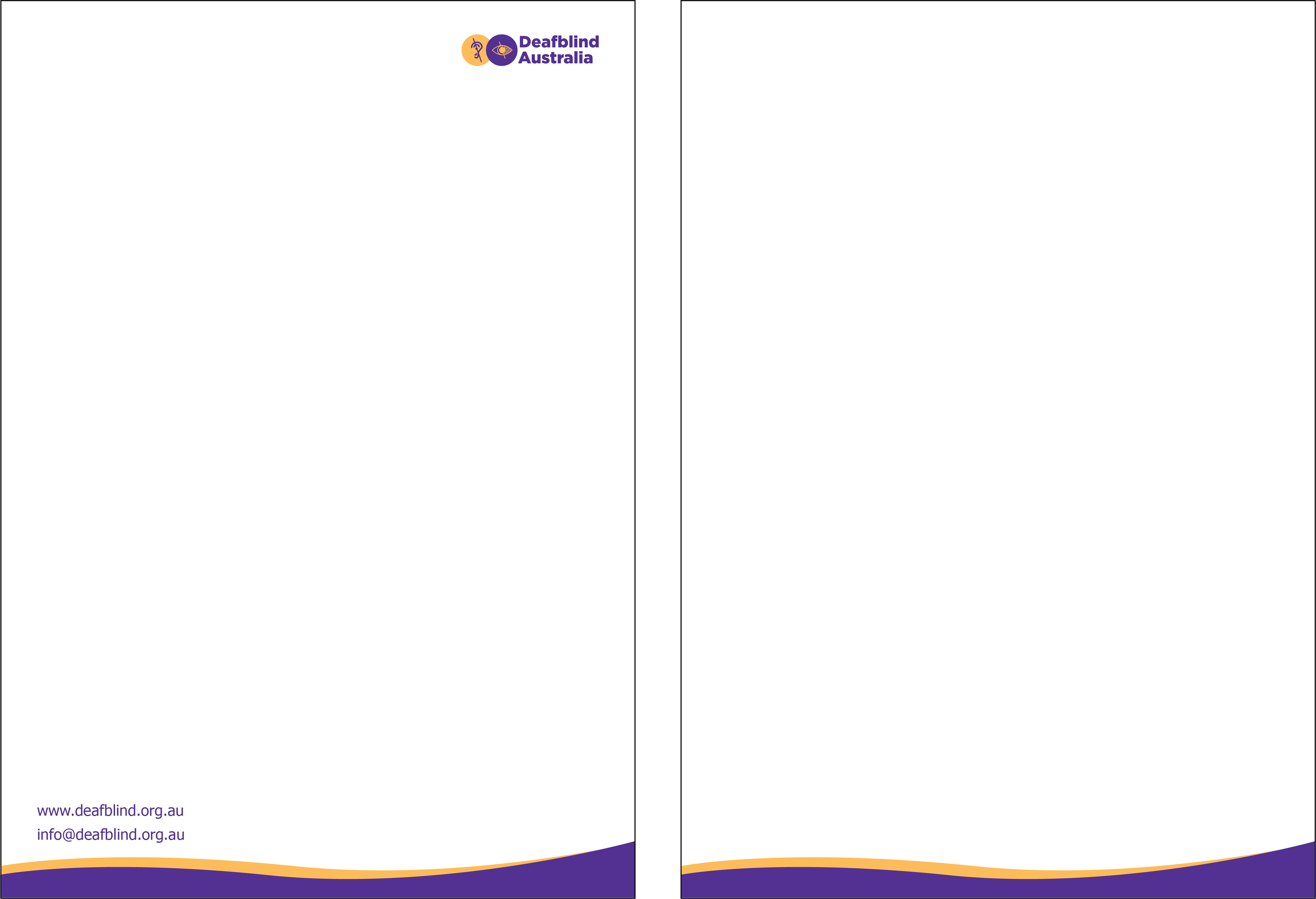
Letterhead
Deafblind Australia logo in top right
Has DBA web address and generic contact email address in the bottom left corner.
Uses the violet and yellow curved shapes along the bottom of the page, overlapped in a similar style to the front of the business card.
Letterhead follower:
Uses the violet and yellow curved shapes along the bottom of the page, overlapped in a similar style to the front of the business card and matching the letterhead design.
Poster
One violet background example with yellow text and two colour logo
One white background example with full colour logo.
Deafblind Australia logo in top right
Uses a circle element from the logo to frame an image on the right side of the page
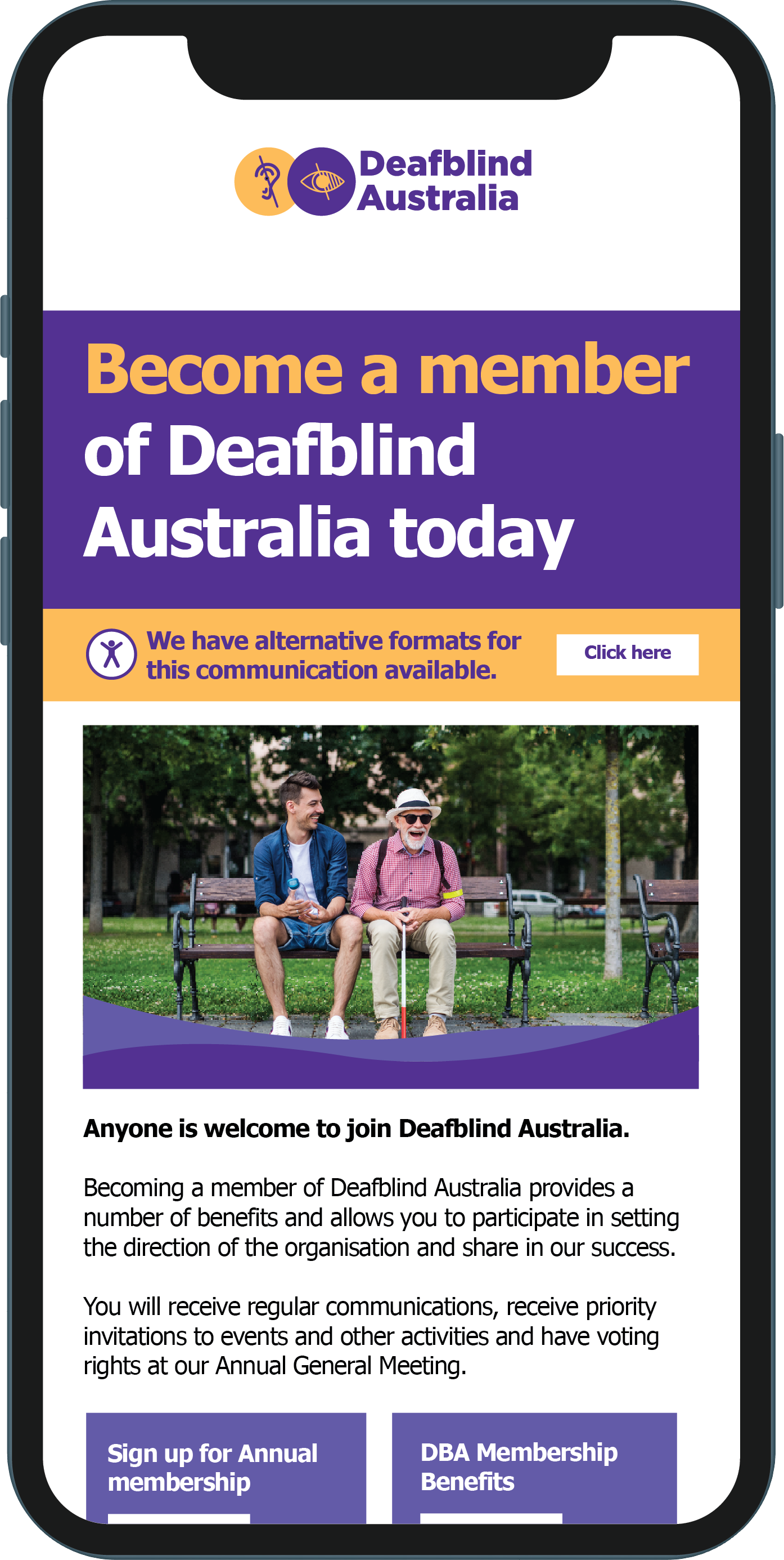
Both posters have a yellow banner along the bottom of the page with an accessibility icon on the left, the text ‘Scan the QR code to view alternative communication formats for this document’, and a QR code linking to the resource on the DBA website on the right.
This yellow banner is a graphic device used across different print and digital elements directing the audience to alternative formats to suit their needs.
Has Berman Corner and QR code in the bottom right.
Design can be more flexible in terms of colours, as long as the main brand violet is used either for text or the background
Yellow and lilac colours create positivity (ie. yellow represents positivity and sunshine) and increase engagement
Violet and yellow curved shapes can be used along the bottom of the page or images, overlapped in a similar style to the front of the business card and matching the letterhead design.
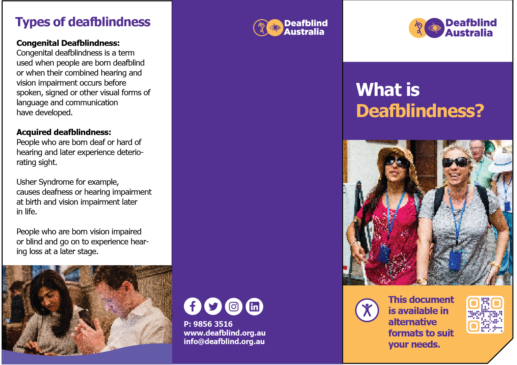
Deafblind Australia logo in the top right of the front page
Uses a yellow banner – a graphic device to direct the audience to alternate document formats on the DBA website
QR code in the yellow banner at bottom of the first page. Berman’s corner is on the bottom right corner of the page
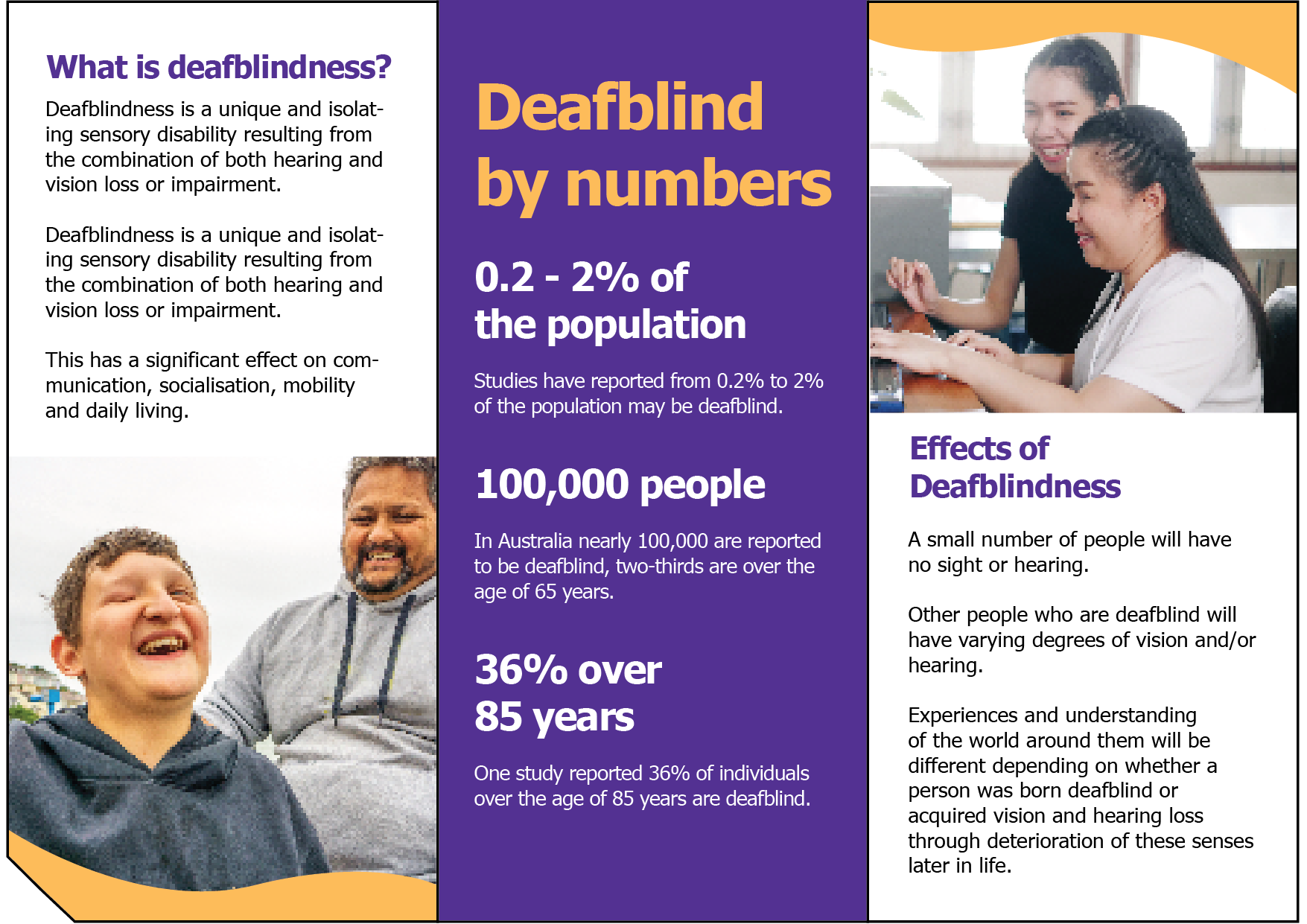
The title of this brochure is “What is deafblindness?” in white and yellow on a violet background (main document headings use purple banner where appropriate, this colour combination meets AAA standards for colour contrast for text)
Frontpage features an image of two deafblind women enjoying a day out
Yellow and lilac curved shapes are used along the bottom of the two of the images, overlapped in a similar style to the front of the business card and letterhead
Contact information is easy to read on the back, with icons in white blue circles
Violet banner below the logo, with yellow and white heading text
Uses the yellow banner – a graphic device to direct the audience to alternate document formats on the DBA website
Violet and lilac curved shapes are used along the bottom of the image, overlapped in a similar style to the front of the business card, letterhead and brochure.