Logo stack
New logo positioned with other logos in the deafblind community including Deafblind Information Australia, Able Australia and Senses W.A.
Primary colours: Blue (main) and Purple (highlight)
Secondary colours: Rose and Yellow
Meanings:
I have chosen these colours because of their accessibility, meaning, positivity and trustworthiness.
Accessibility:
These colours meet the accessibility contrast standards, they were tested using this site https://webaim.org/resources/contrastchecker/
WCAG 2.0 level AA requires a contrast ratio of at least 4.5:1 for normal text and 3:1 for large text.
Blue meanings:
Purple/Rose meanings:
Here are some of the physical effects of pink on us:
Yellow meanings:
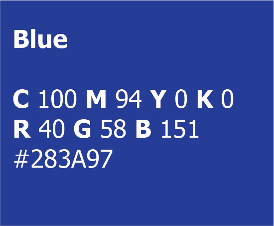
Blue
Pantone P 99-8 C
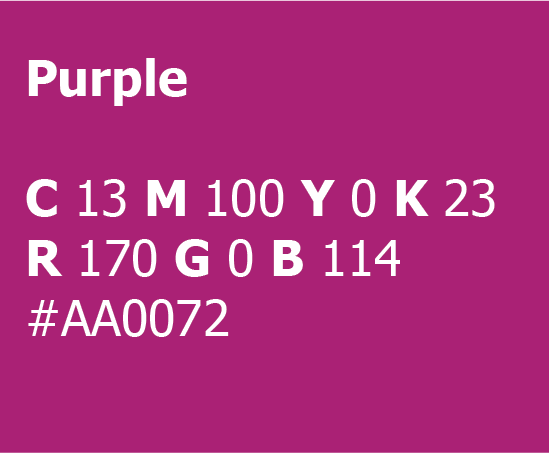
Purple
Pantone P 81-8 C
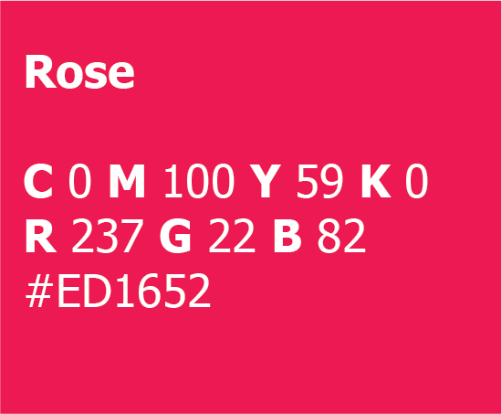
Rose
Pantone P 59-8 C
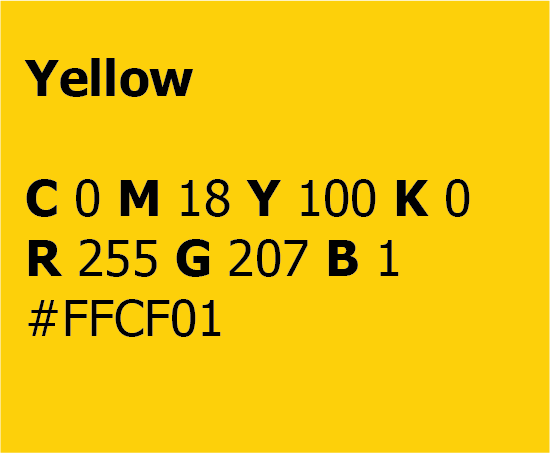
Yellow
Pantone P 7-8 C
The typeface used is called Atkinson Hyperlegible, it has been developed by the Braille Institute to have greater legibility and readability for low vision readers (https://brailleinstitute.org/freefont). This works by focusing on distinguishing each letterform for character recognition.

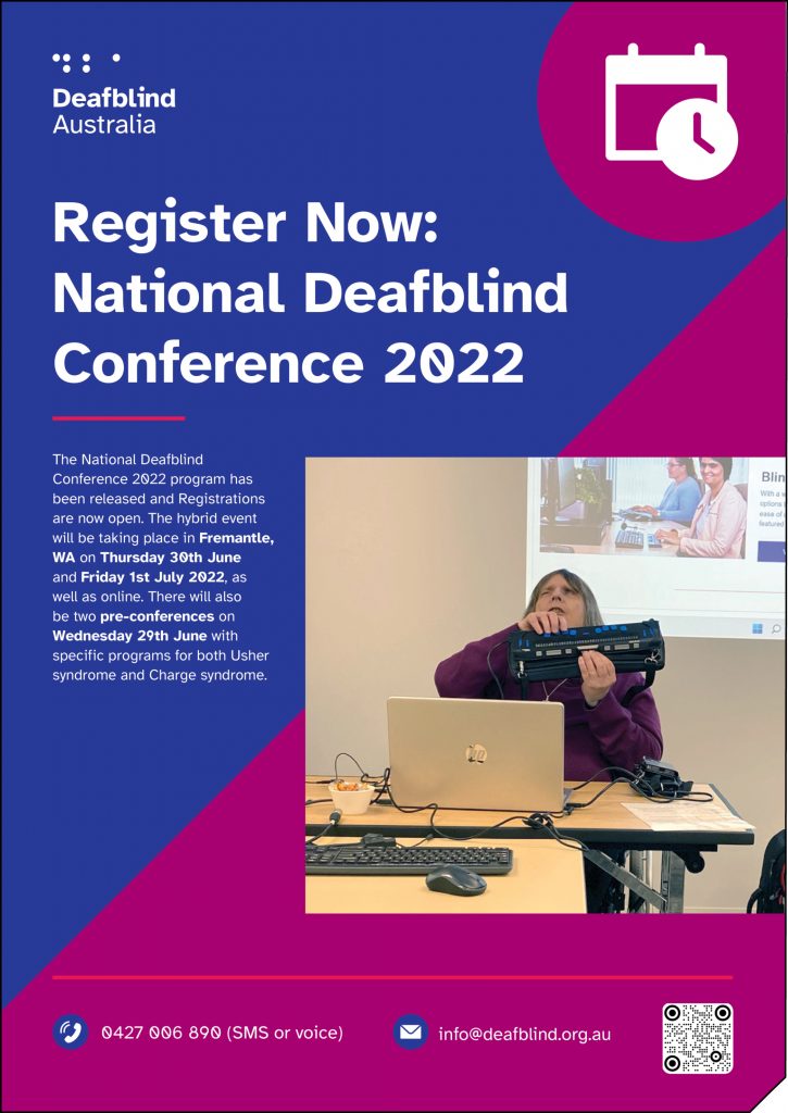
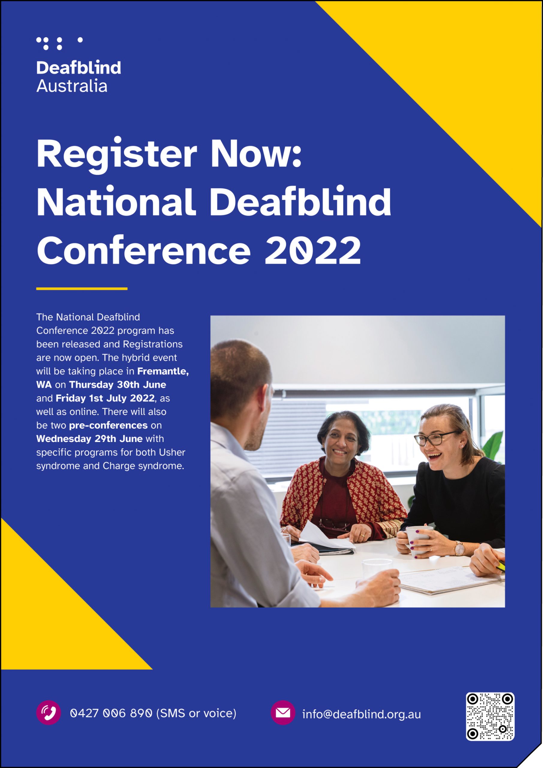
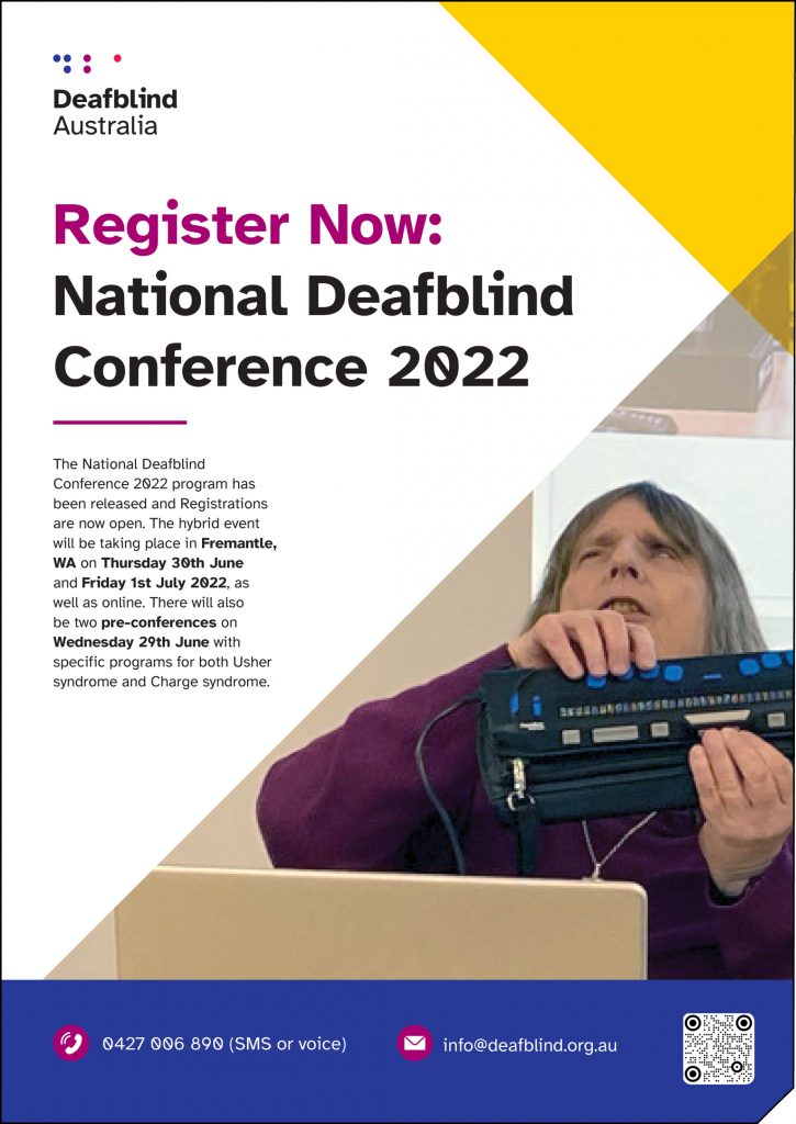
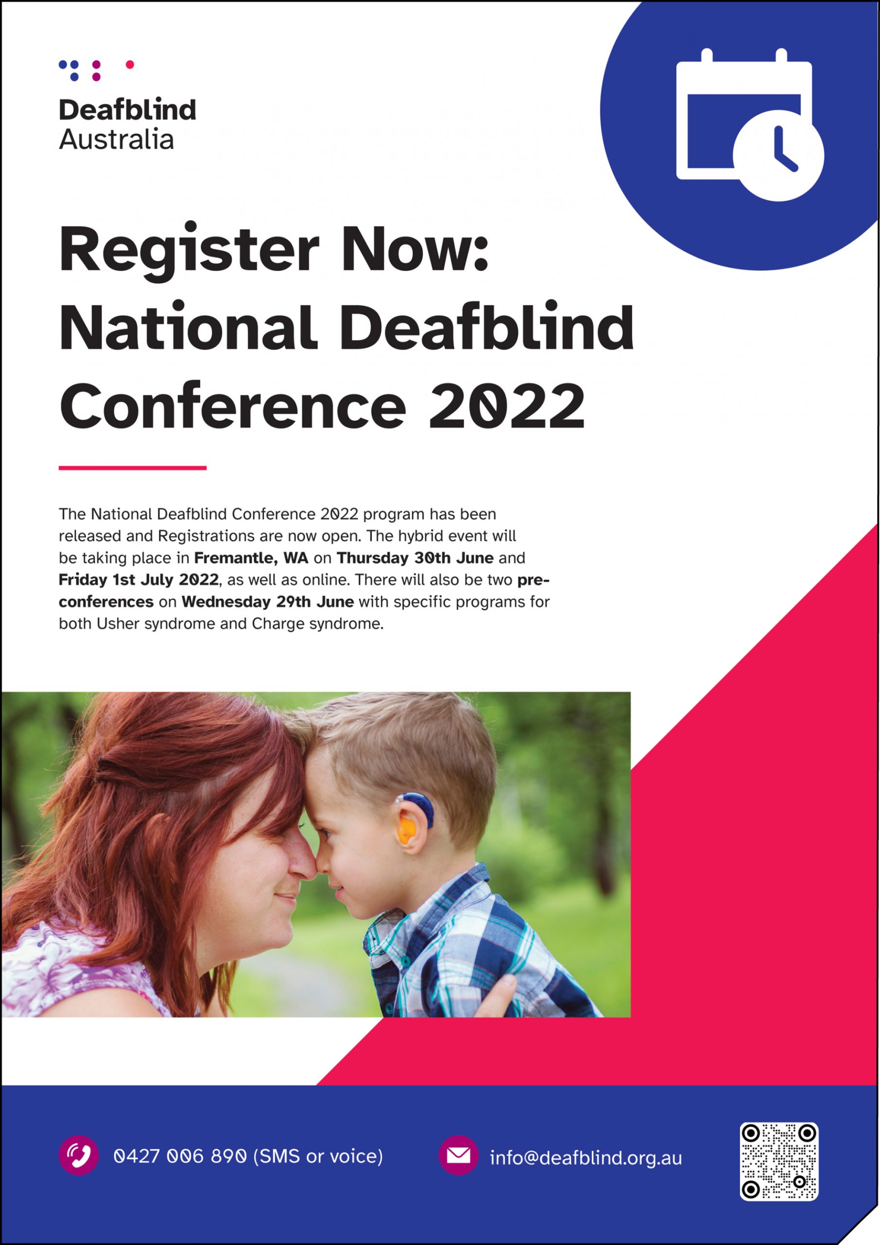
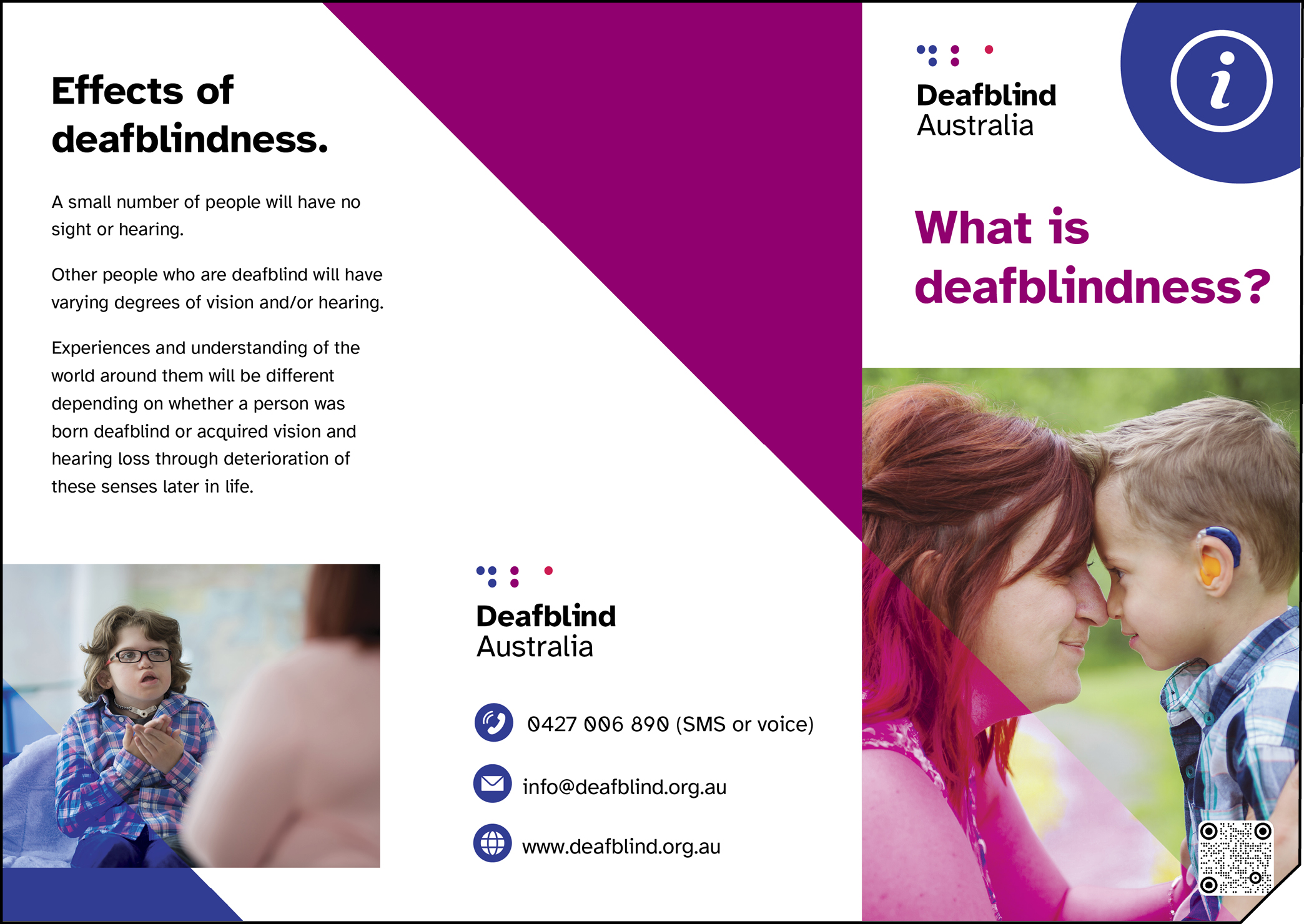
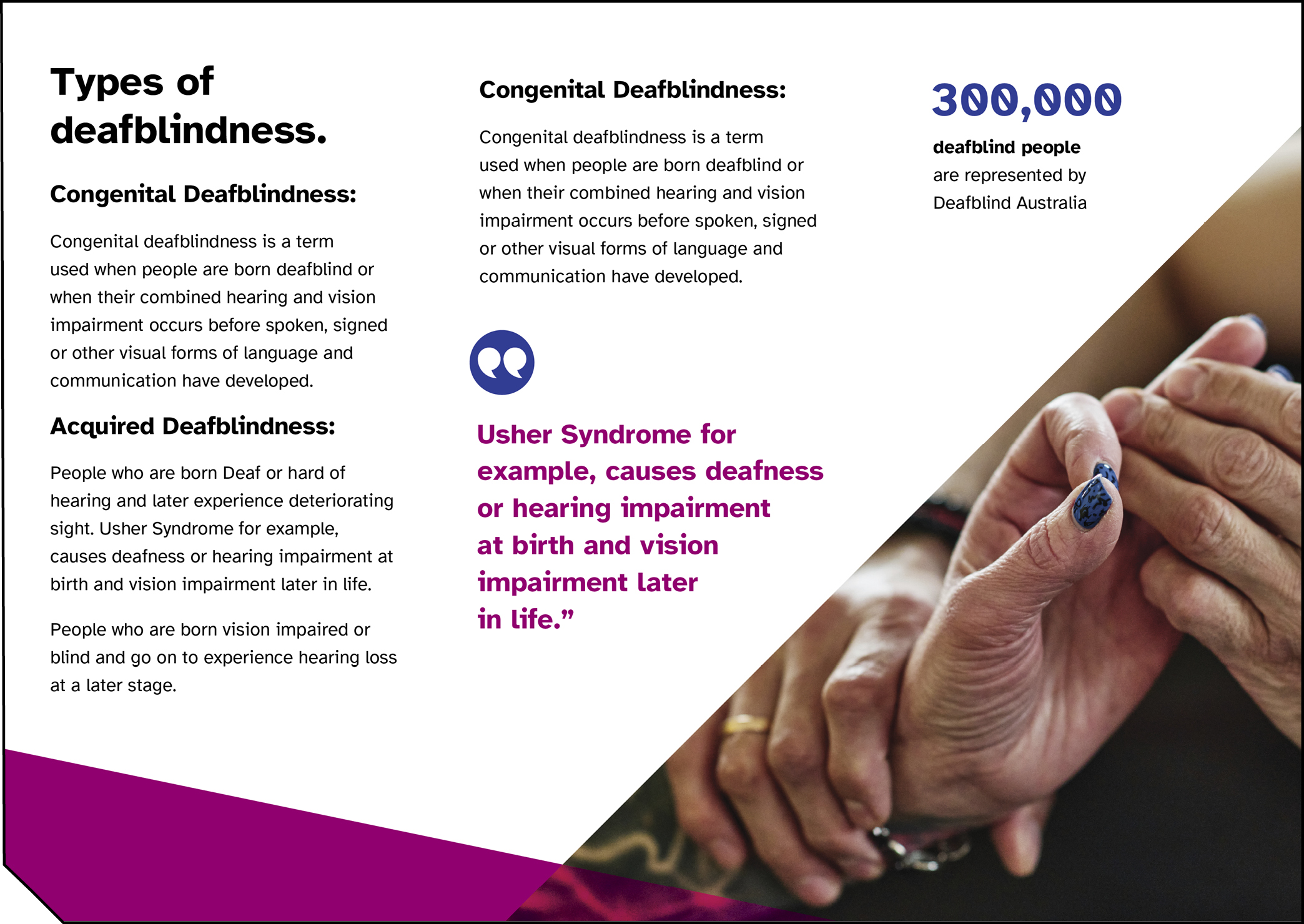
For all print materials, there will be a diagonal cut from the bottom right of the document to provide a tactile way for vision impaired people to know that there is a QR code within 3.5 inches of the corner. This is known as Berman Corner.

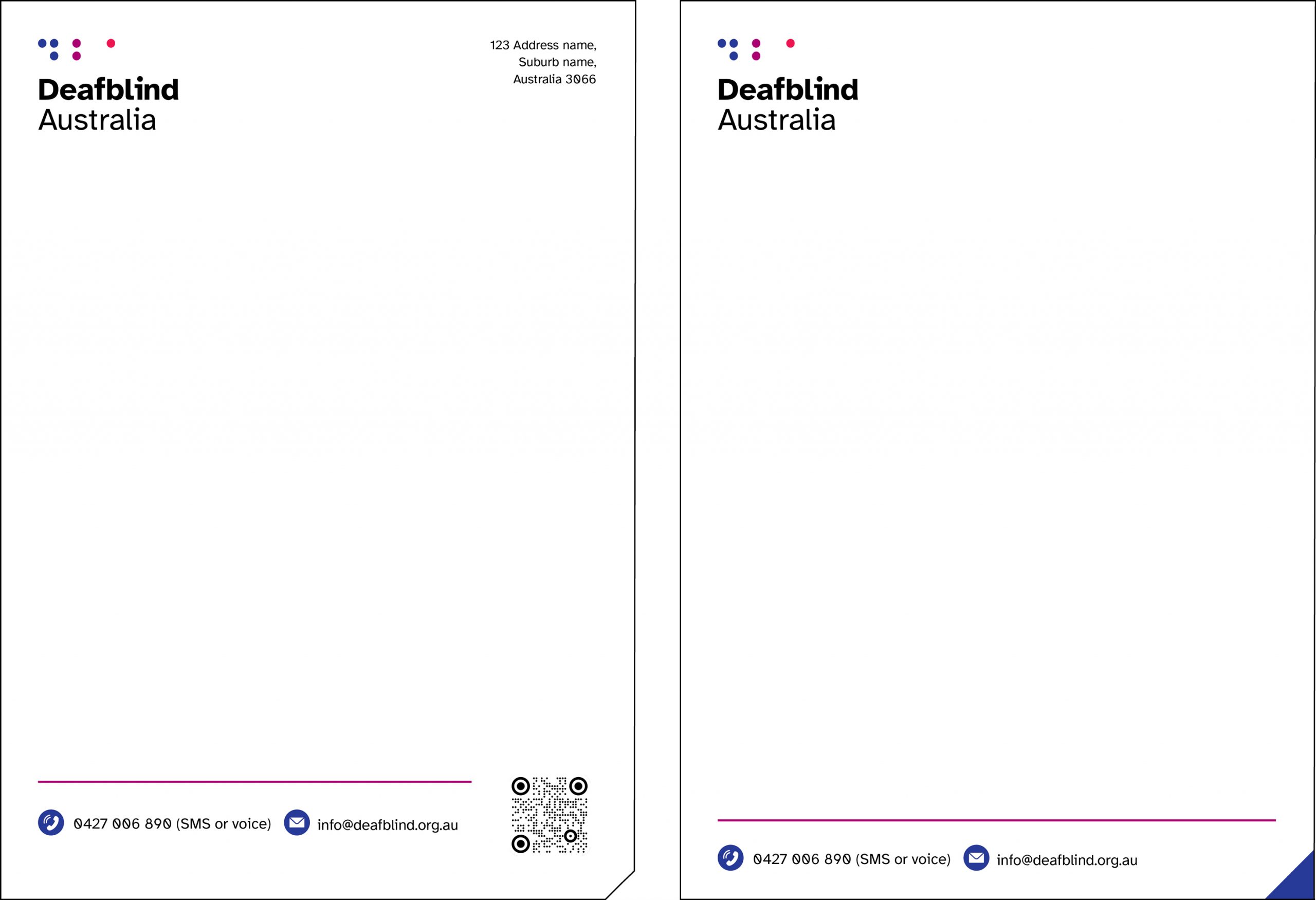
Printed letterhead and business card:
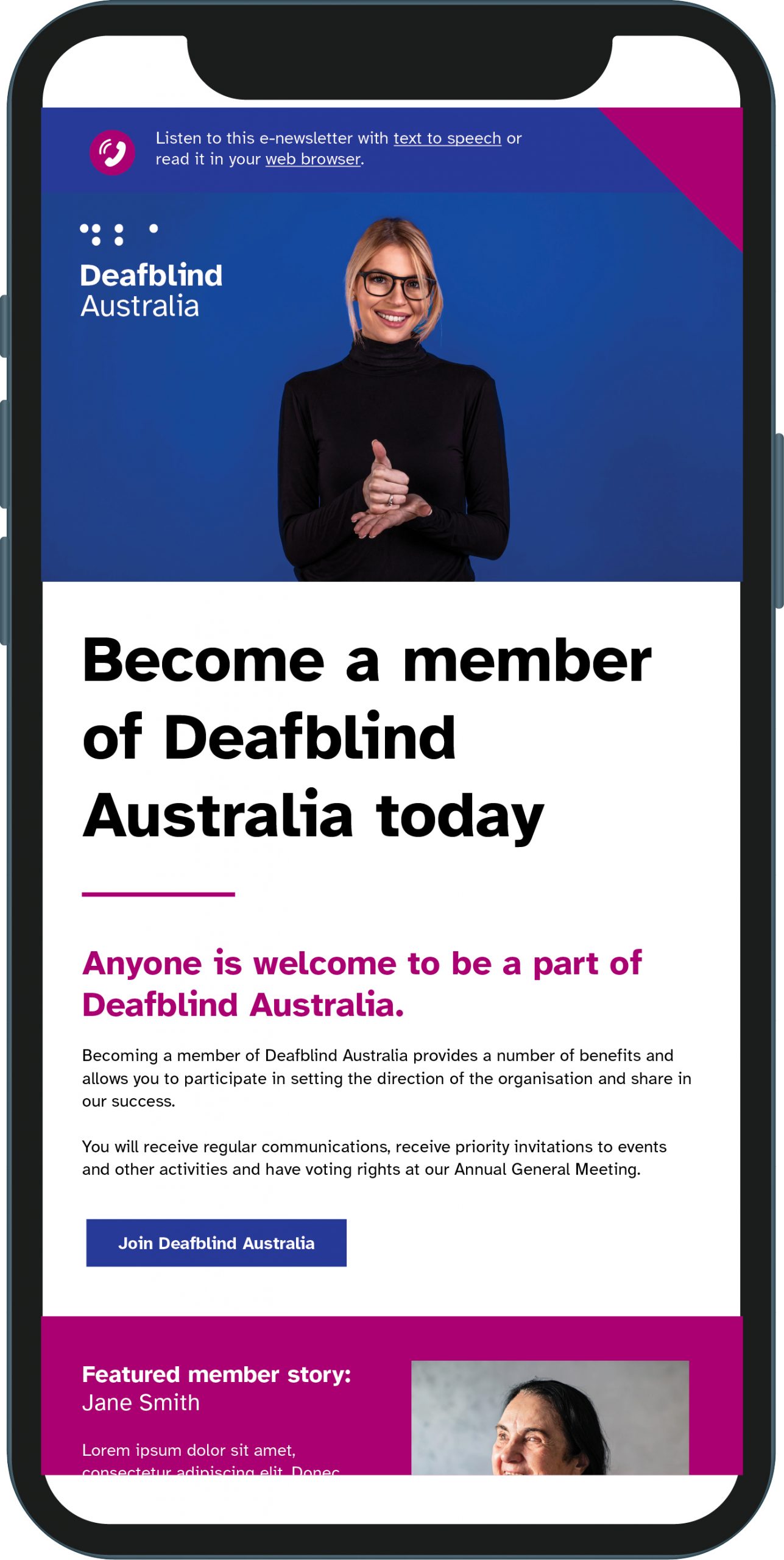
Digital letterhead:
