This logo concept is a refresh of the current logo. This has been designed to enhance the accessibility, readability and recognisability of the current logo.
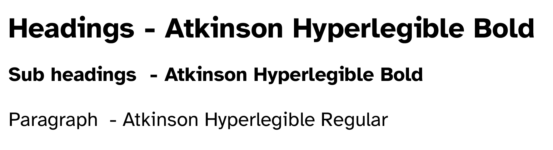
The typeface used is called Atkinson Hyperlegible, it has been developed by the Braille Institute to have greater legibility and readability for low vision readers (https://brailleinstitute.org/freefont). This works by focusing on distinguishing each letterform for character recognition.
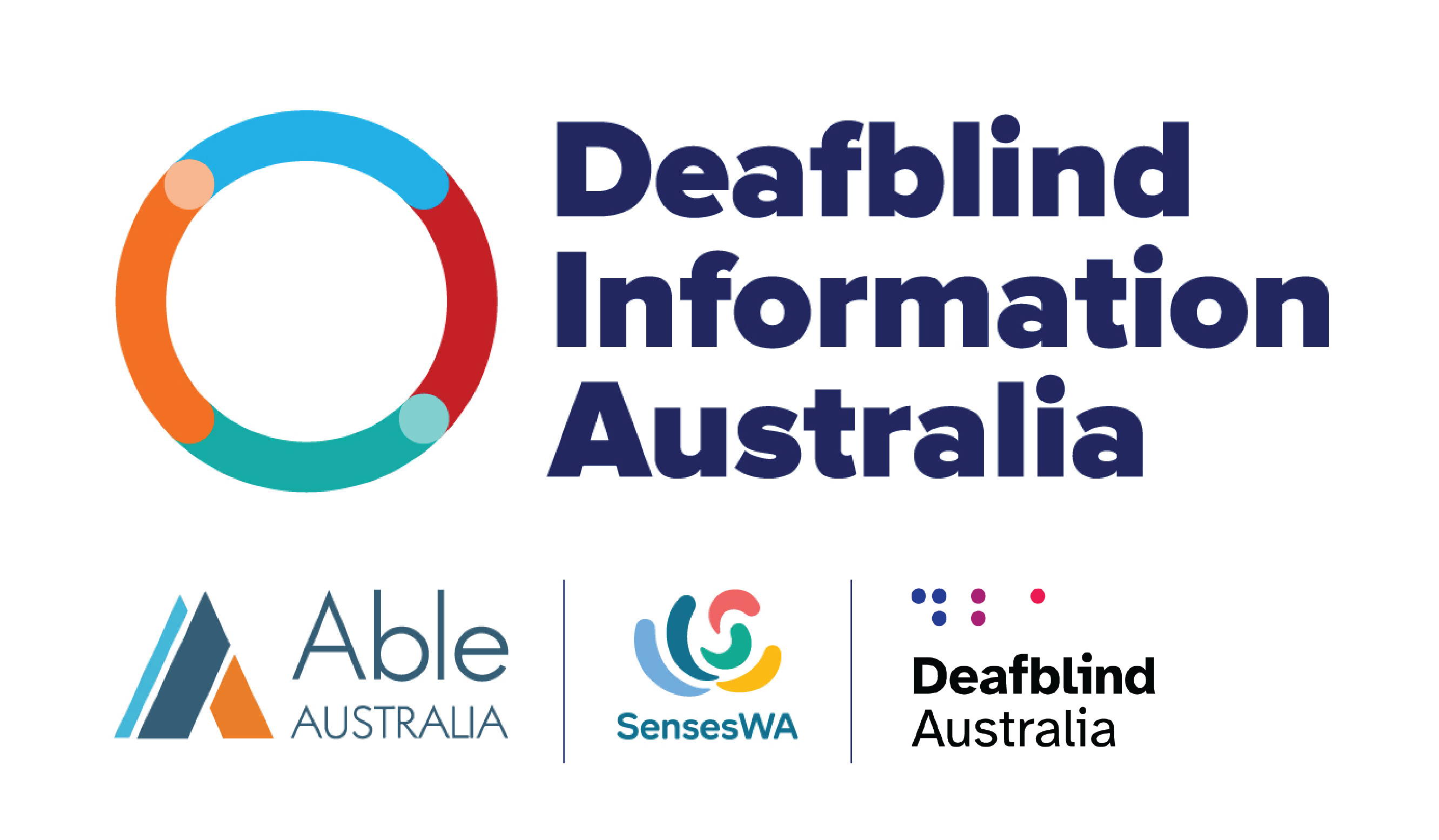
The letters DBA in braille make up the icon. This introduces the main colours: Blue, Purple and Rose
Logo stack
New logo positioned with other logos in the deafblind community including Deafblind Information Australia, Able Australia and Senses W.A.
Colours
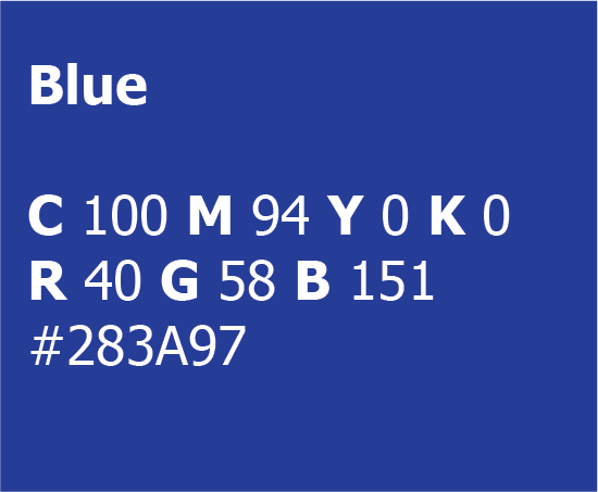
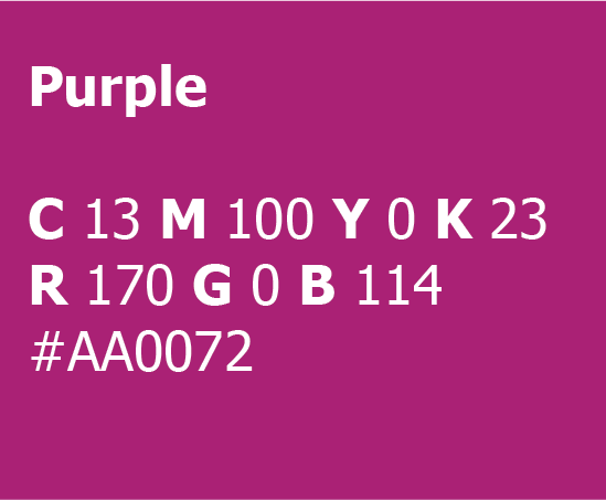
Primary colours: Blue (main) and Purple (highlight)
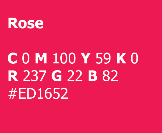
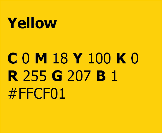
Secondary colours: Rose and Yellow
Meanings:
I have chosen these colours because of their accessibility, meaning, positivity and trustworthiness.
Blue meanings:
Dark blue was chosen by the World Federation of the Deaf and Deaf associations around the World to represent Deafhood. That means an individual and collective journey to campaign against audism and a focus on the positivity of Deaf identities, including Sign Languages, Deaf Culture and Deaf History. (Information from Irish Deaf Society)
This colour also promotes trust and is used in the corporate world for this reason.
Purple/Rose meanings:
Here are some of the physical effects of pink on us:
Energize – The red influence on pink assures brighter shades of this colour give us energy.
Relaxing – On the white side, pink is a relaxing colour and is known for toning down aggressive behaviour, especially its pale tints.
Uplifting – Pink is a charming colour that brings happy and optimistic thoughts.
Comforting – Because pink is such an optimistic colour, it brings hope to those in need.
Yellow meanings:
Yellow is associated with warmth, sunshine, and positivity.
It’s a colour that promotes activity and interaction.
Colour codes:
Blue Pantone P 99-8 C
Purple Pantone P 81-8 C
Rose Pantone P 59-8 C
Yellow Pantone P 7-8 C
Typography
The typeface used is called Atkinson Hyperlegible, it has been developed by the Braille Institute to have greater legibility and readability for low vision readers (https://brailleinstitute.org/freefont). This works by focusing on distinguishing each letterform for character recognition.
Sans serif font
Comes in Bold and Regular
Developed to be accessible
Headings and subheadings use bold
Paragraphs use regular
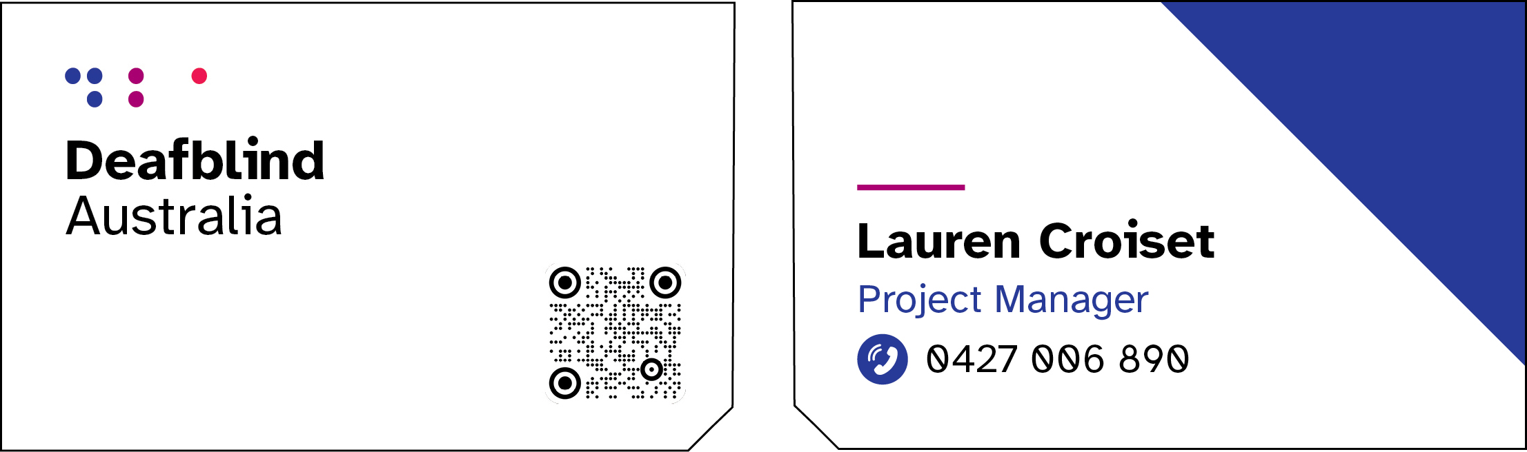
Business card
For all print materials, there will be a diagonal cut from the bottom right of the document to provide a tactile way for vision impaired people to know that there is a QR code within 3.5 inches of the corner. This is known as Berman Corner.
Front has Deafblind Australia logo in top left
Where possible, the DBA logo icon should be embossed to create braille
Front bottom right corner has the QR code (this code leads to the team member’s profile on the DBA website)
Uses Berman corner on the bottom right for QR code
Back has name, position and phone number in accessible large text
Back has blue triangle element
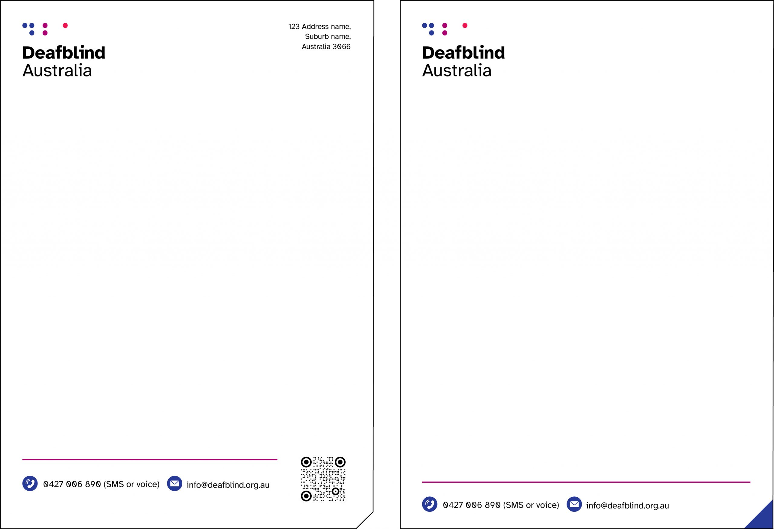
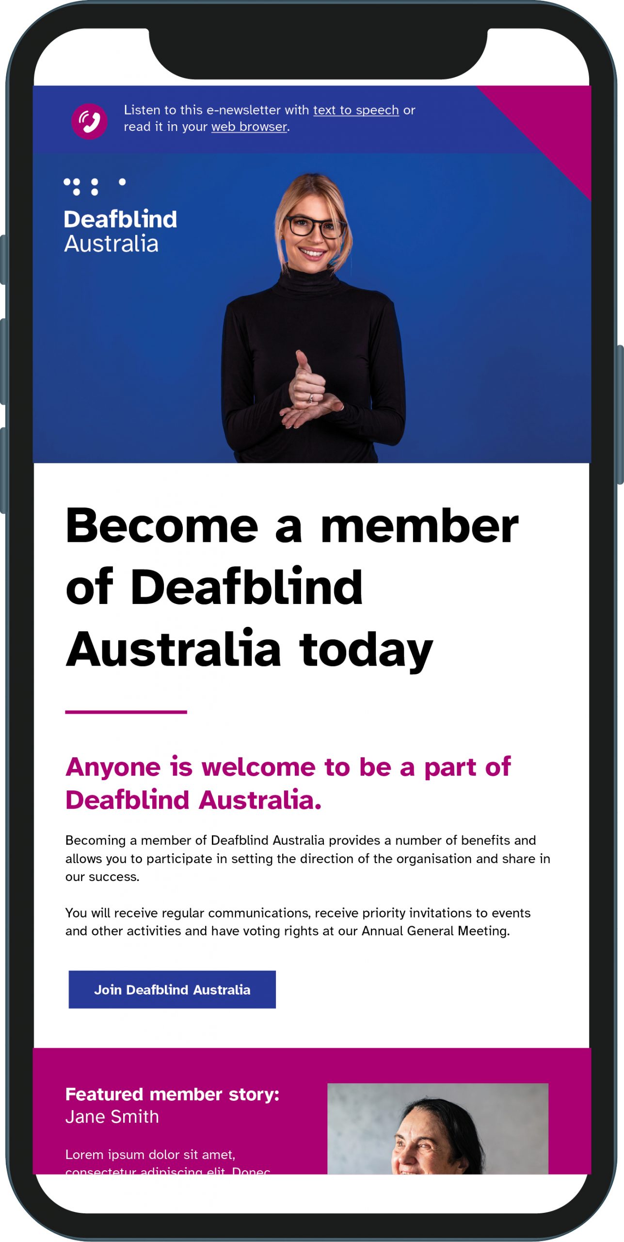
Letterhead
Printed letterhead and business card:
Deafblind Australia logo in top left
Uses Berman corner on the bottom right for QR code (this code leads to the contact page on the Deafblind Australia website).
Where possible, the DBA logo icon should be embossed to create braille
Digital letterhead:
Deafblind Australia logo in top left
To be sent digitally or when additional space is needed
Shorter footer for additional writing space
No QR code
Triangle element in bottom right is a visual representation of Berman Corner
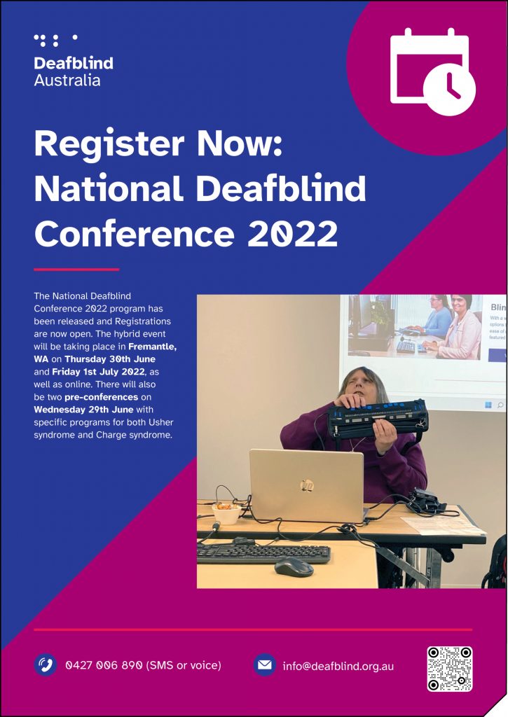
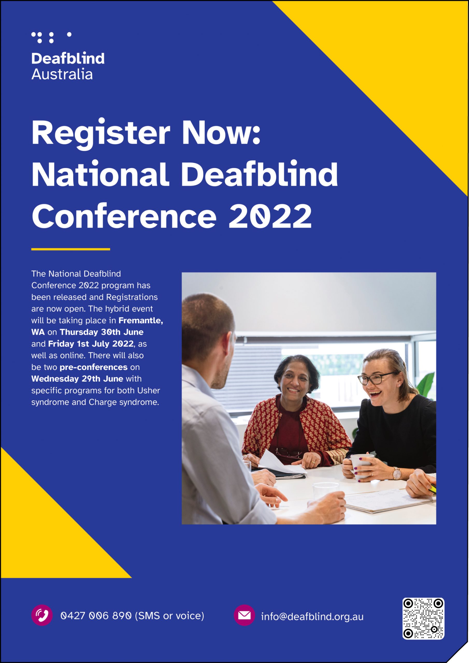
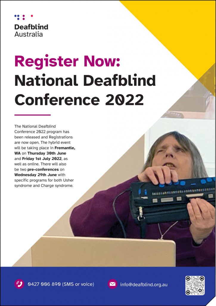
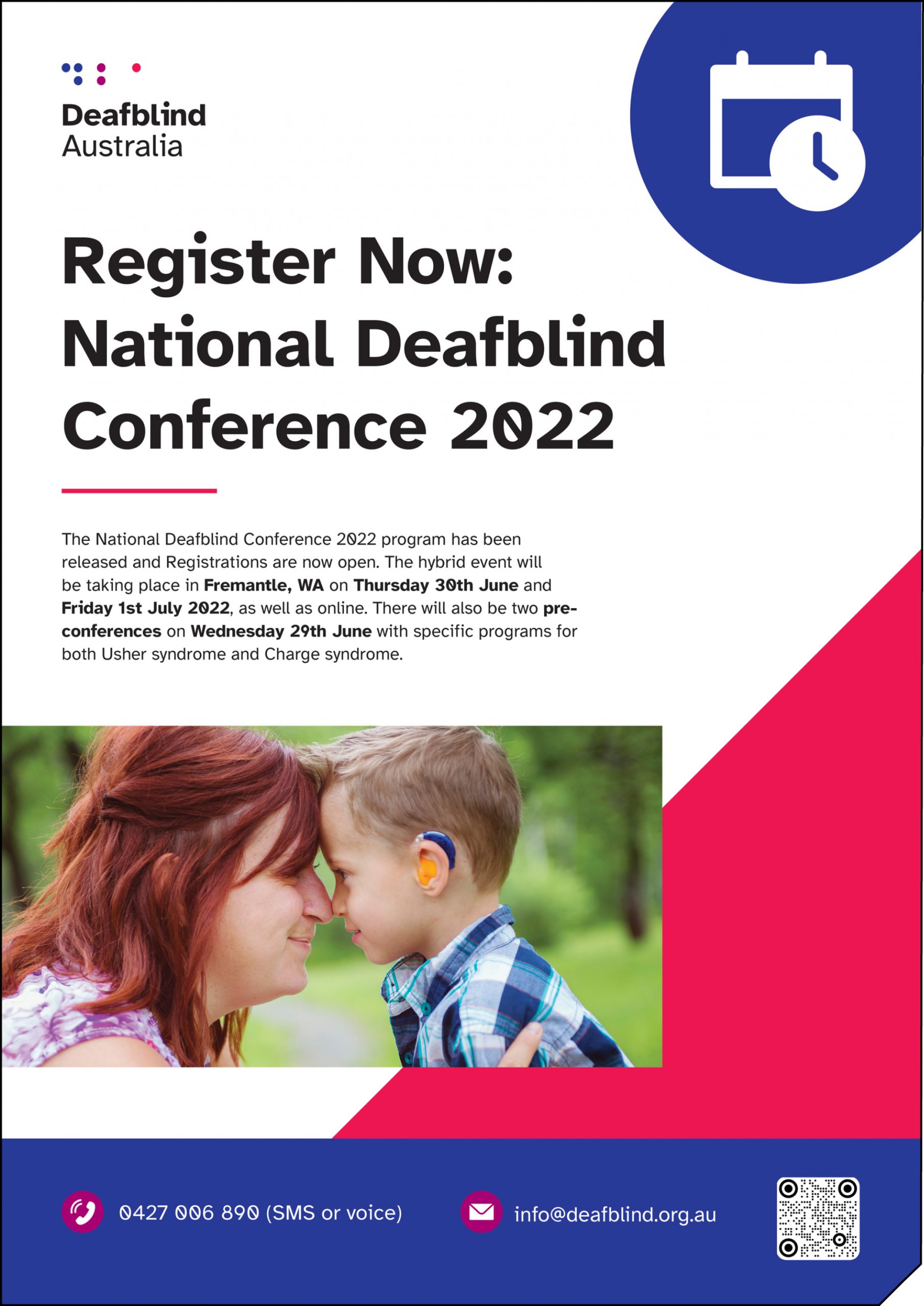
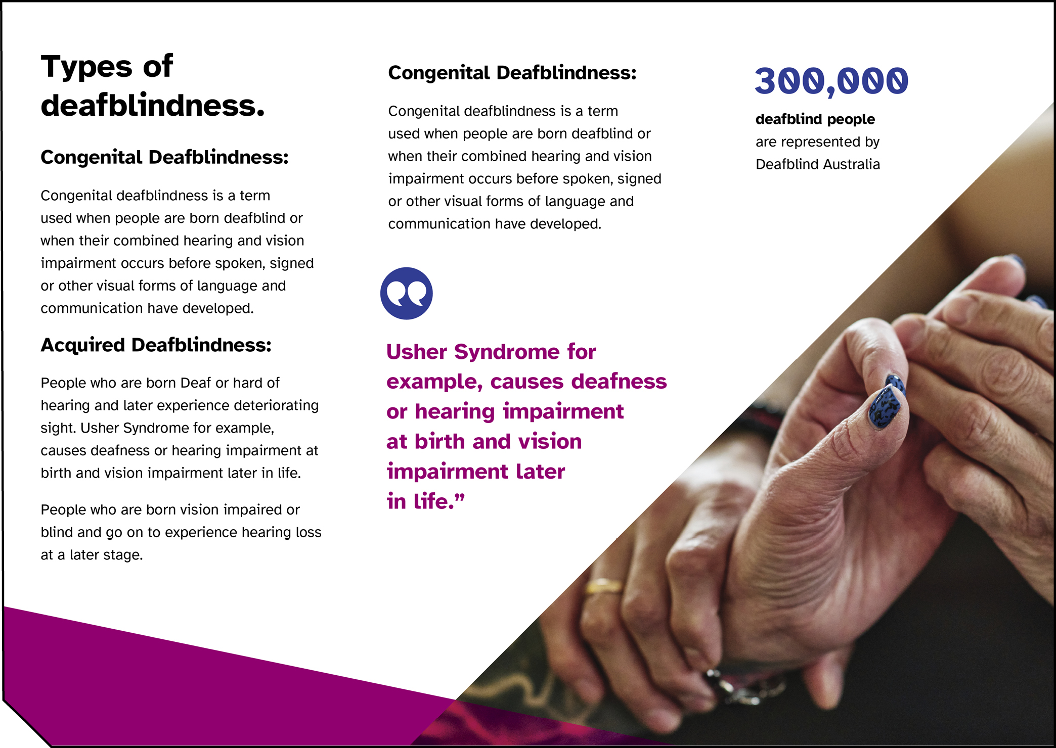
Posters
Two dark background examples with white text and white logo
Two light background examples with full colour logo
Deafblind Australia logo in top left
Where possible, the DBA logo icon should be embossed to create braille
Uses circle element from logo in the top right corner of front page
Inside this circle is a calendar and clock icon, which will change to symbolise the poster content
Has Berman Corner and QR code in the bottom right (QR code will link to the event or campaign page)
Design can be more flexible in terms of colours, as long as the main brand blue is used either in the footer or the background
Yellow and Rose secondary colours can create positivity (ie. yellow represents positivity and sunshine) and increase engagement
Triangles and images overlap to create a sense of 3D space and increase engagement
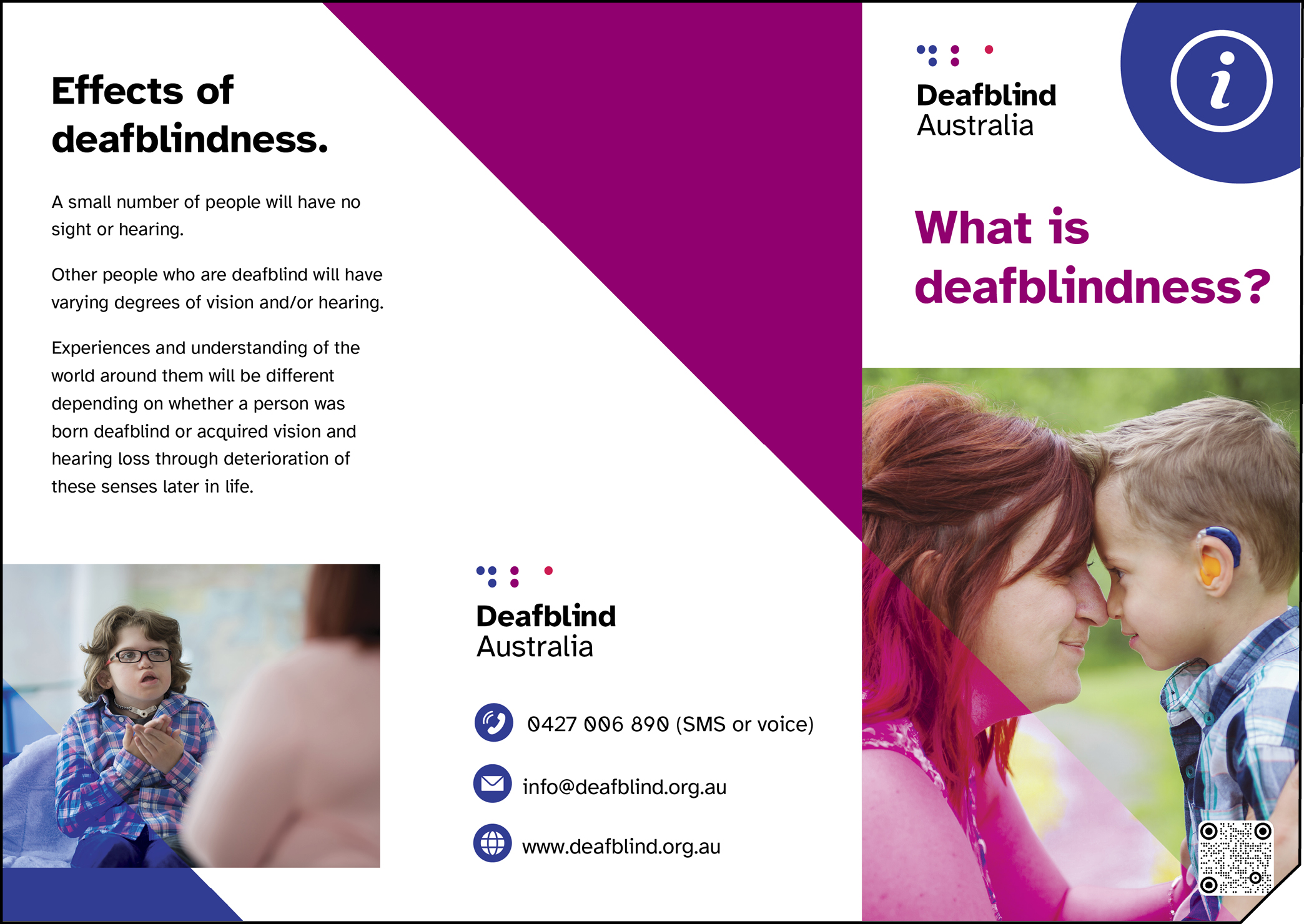
Deafblind Australia logo in top left of front page
Uses circle element from logo in the top right corner of front page
Inside this circle is an information icon, which will change to symbolise the brochure content
The title of this brochure is “What is deafblindness?” in purple (main document headings use purple where appropriate, this colour meets AA standards for colour contrast for large text
Has Berman Corner and QR code in the bottom right (QR code will link to the associated website page eg. a page called “What is deafblindness?”)
Front page features image of mother and her deaf child smiling face to face
Triangle element is used in the primary highlight colour (purple) to bring some warmth and engagement, it is also used in the primary main colour (blue) to balance the purple and increase brand recognition
Contact information is easy to read on the back, with icons in dark blue circles